In the digital economy, the path to a sale is rarely linear. Customers navigate complex networks of information, touchpoints, and emotional triggers before committing to a transaction. Designing a customer journey is not merely about creating a sequence of web pages; it is about architecting an experience that aligns with human decision-making processes. When executed with precision, a well-structured journey reduces cognitive load, builds trust, and naturally leads a prospect toward a purchase. This guide outlines the strategic framework required to map, design, and optimize these pathways effectively.
Understanding the Core Concept of Journey Mapping 🧠
Customer journey mapping is the visual representation of the process a user goes through to engage with a brand. It extends beyond the initial click or ad impression. It encompasses every interaction, from the first moment of awareness to post-purchase support and advocacy. The objective is to see the experience through the eyes of the buyer, not the internal structure of the organization.
Many organizations fail at this because they map what they think the user does, rather than what the user actually does. A robust design process relies on empirical data and qualitative research. It requires stepping away from assumptions about user behavior. Instead, teams must observe actual interaction patterns.
- Internal vs. External: Internal maps often focus on workflow efficiency. External maps focus on customer satisfaction and emotional state.
- Static vs. Dynamic: A static map shows a single path. A dynamic map accounts for branching paths based on user intent and behavior.
- Individual vs. Aggregate: One user’s journey is unique. Effective design considers the aggregate of many journeys to find common patterns.
By distinguishing between these variations, teams can build a model that is both realistic and actionable. The goal is to create a narrative that guides the user without manipulating them. The distinction lies in facilitation versus obstruction.
The Psychology Behind the Path 🧭
Understanding why a buyer moves through a journey requires knowledge of behavioral psychology. Human decision-making is not purely rational. It is influenced by emotions, social proof, and cognitive biases. A journey that ignores these factors often stalls at the consideration phase.
Three psychological principles are critical to journey design:
- Trust Accumulation: Trust is not given at the start; it is earned through consistent, positive interactions. Every touchpoint must reinforce credibility. A mismatch between the promise of an advertisement and the reality of the landing page breaks this trust immediately.
- Cognitive Ease: Users prefer paths that require less mental effort. If a form is too long, or information is hard to find, the brain registers friction. This friction is often where the purchase is abandoned.
- Social Validation: People look to others to determine the correct action. Testimonials, case studies, and usage statistics serve as validation signals that reduce the perceived risk of buying.
When designing the flow, ask whether each step reduces anxiety or increases it. A step that adds a question about personal data should only appear if the value provided justifies the privacy trade-off. This balance is the essence of ethical journey design.
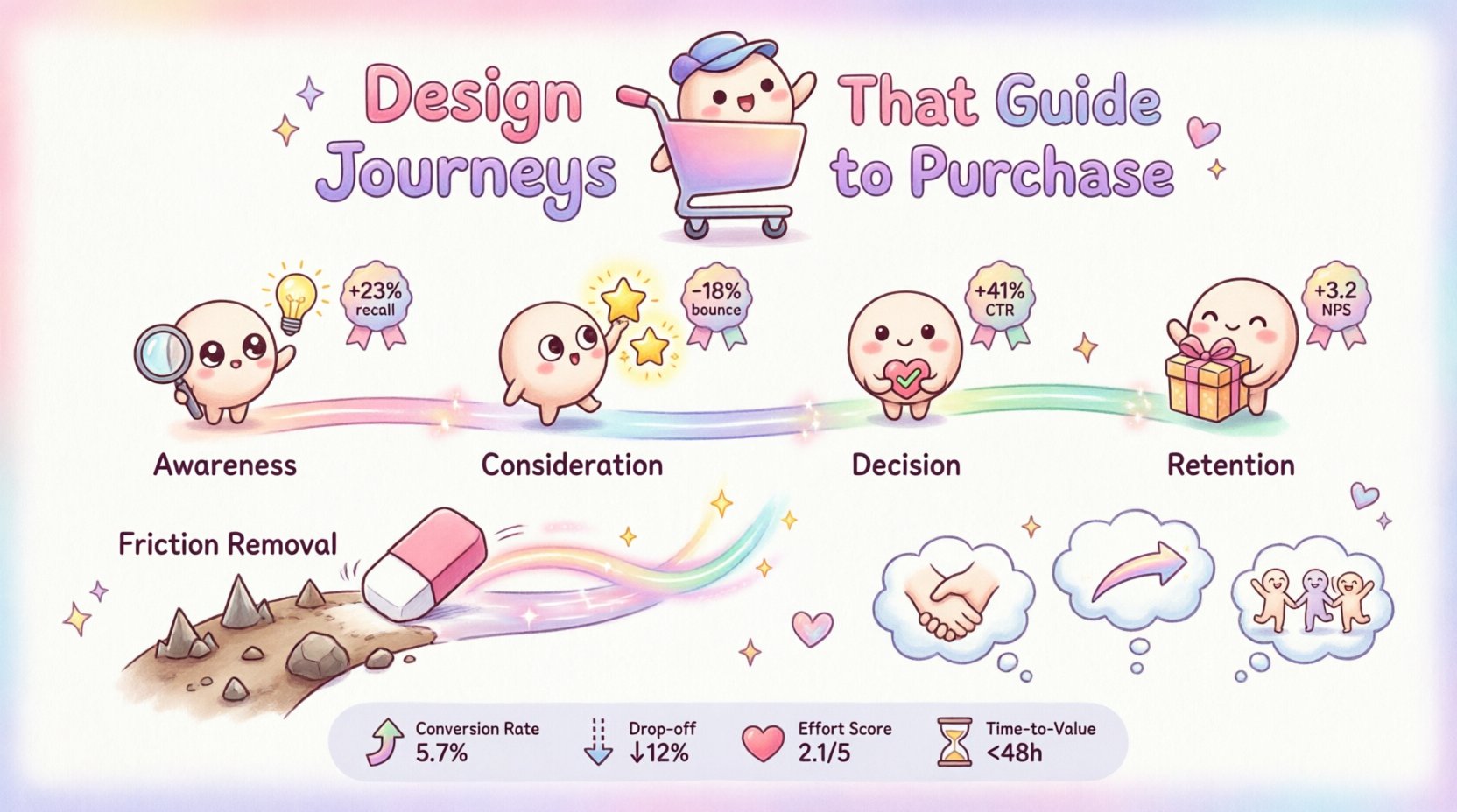
Mapping the Stages of Conversion 🔄
A standard purchase funnel consists of distinct stages. However, modern journey mapping requires a more nuanced view. We categorize these stages based on the user’s intent and the type of content required to move them forward.
Each stage has a specific goal and requires specific metrics to track progress. Relying on a single metric, such as total conversions, hides the bottlenecks that occur earlier in the process.
| Stage | Primary Goal | Key Metric | Typical Content |
|---|---|---|---|
| Awareness | Capture Attention | Impressions / Reach | Social Media, Blog Posts, Ads |
| Consideration | Educate & Evaluate | Time on Page / Bounce Rate | Whitepapers, Webinars, Comparison Guides |
| Decision | Validate & Commit | Cart Add / Trial Sign-up | Demos, Pricing Pages, Testimonials |
| Retention | Sustain Relationship | Churn Rate / LTV | Email Newsletters, Support Tickets, Updates |
1. The Awareness Stage
This is the entry point. The user realizes they have a problem or a need. They may not know your brand exists yet. The content here must be broad enough to catch attention but specific enough to signal relevance. Search engine optimization plays a major role here, as users often search for solutions to their problems rather than specific brand names.
- Focus on educational content that solves immediate micro-problems.
- Ensure mobile optimization is flawless, as this traffic often comes from mobile devices.
- Use clear calls to action that do not demand a purchase, but rather an engagement.
2. The Consideration Stage
Once aware, the user begins comparing solutions. They are looking for the best fit. This is where differentiation happens. The journey must highlight why your approach is superior without disparaging competitors directly. Clarity is the primary currency in this stage.
- Provide detailed feature breakdowns.
- Offer tools that help the user calculate their own needs or ROI.
- Reduce the complexity of the decision by offering curated options.
3. The Decision Stage
Here, the user is ready to buy but needs a final push. Risk mitigation is the priority. They are looking for reassurance that they are making the right choice. Social proof becomes the dominant factor.
- Display verified reviews prominently.
- Offer guarantees or trial periods to lower the barrier to entry.
- Ensure the checkout or sign-up process is streamlined and transparent regarding costs.
4. The Retention Stage
The journey does not end at the sale. The post-purchase experience determines whether the user becomes a repeat customer or a promoter. This stage is often neglected in favor of acquisition, yet it offers the highest return on investment.
- Onboarding sequences should be immediate and helpful.
- Support channels must be accessible and responsive.
- Regular engagement keeps the brand top-of-mind for future needs.
Touchpoint Integration and Consistency 📱
A journey is composed of touchpoints. These are the specific moments of interaction between the user and the brand. They can be digital (website, email, app) or physical (store visit, packaging, phone call). The consistency of the message and experience across these touchpoints is vital.
If a user sees an ad promising “fast support” but lands on a website with no visible contact information, the journey breaks. This dissonance creates doubt. The design must ensure that the tone, visual identity, and value proposition remain coherent throughout the entire path.
- Channel Alignment: Ensure that the experience on social media matches the experience on the website.
- Data Continuity: If a user starts a task on mobile and switches to desktop, their progress should be preserved. They should not have to repeat information.
- Timing: The frequency of communication matters. Too much contact feels like harassment; too little feels like neglect. Balance is key.
Mapping these touchpoints involves creating a matrix of every possible interaction. This matrix helps identify gaps where the user might fall through the cracks. For example, if a user abandons a cart, is there an automated follow-up? If they download a guide, is there a nurture sequence?
Identifying and Removing Friction 🚧
Friction is the resistance a user feels during the journey. It is the reason people do not complete a purchase. Friction can be functional (a broken link) or psychological (confusion about pricing). Identifying these points is the most critical step in optimization.
Friction analysis requires looking at where users drop off. Heatmaps can show where users stop scrolling. Session recordings can show where they hesitate. These tools reveal the physical and emotional barriers in the path.
| Friction Type | Common Cause | Strategic Solution |
|---|---|---|
| Information Overload | Too many choices or complex text | Simplify copy and use progressive disclosure |
| Process Complexity | Too many form fields | Reduce fields to essential data only |
| Trust Deficit | Lack of security badges or reviews | Add social proof and security indicators |
| Technical Errors | Slow load times or bugs | Optimize performance and test rigorously |
Removing friction is an iterative process. You cannot fix everything at once. Prioritize the friction points that have the highest impact on conversion rates. Small improvements in key areas yield better results than large improvements in low-impact areas.
For instance, reducing the number of clicks required to purchase often has a more significant impact than changing the color of the button. The path of least resistance is the path of least resistance. Design for this reality.
Measuring Success and Iteration 📊
A journey map is a living document. It must evolve as user behavior changes and as market conditions shift. Static maps become obsolete quickly. Success is measured not just by the final conversion, but by the efficiency of the path.
Key performance indicators (KPIs) should be defined for each stage of the journey. This allows teams to pinpoint exactly where the journey is failing. If the Awareness stage is strong but the Consideration stage is weak, the issue lies in the content or the value proposition, not the traffic source.
- Conversion Rate: The percentage of users who complete the desired action.
- Drop-off Rate: The percentage of users who leave at a specific stage.
- Customer Effort Score: A measure of how easy it was for the user to complete the task.
- Time to Value: How long it takes for the user to realize the benefit of the product.
Regular auditing of these metrics ensures the journey remains optimized. A/B testing is a powerful tool here. Test different headlines, layouts, and flows to see what resonates best with the audience. Let the data dictate the design changes, not opinion.
Organizational Alignment 🤝
The most sophisticated journey map will fail if the organization does not support it. Marketing, sales, product, and support teams must be aligned on the customer experience. Silos create disjointed journeys where the user feels like they are talking to different entities.
Marketing might promise one thing, while sales delivers another. Support might lack the context to help a customer who was sold a specific feature. Breaking down these silos is a management challenge, not just a design challenge.
- Shared Goals: Ensure all departments have KPIs related to the customer journey, not just their specific silo.
- Shared Data: Information about the customer should flow freely between departments.
- Shared Language: Define what terms like “lead” or “qualified” mean across the organization to avoid confusion.
When the organization moves as one unit toward the customer experience, the journey becomes seamless. The user perceives a unified brand, which reinforces trust and loyalty. This alignment is the infrastructure that holds the journey together.
Strategic Implementation Steps
To begin implementing this framework, follow a structured approach. Do not attempt to redesign the entire experience overnight. Start with the high-value segments of your user base.
- Define the Persona: Who is the primary buyer? What are their goals and pain points?
- Gather Data: Collect quantitative and qualitative data on current behaviors.
- Map the Current State: Visualize where the user currently goes. Identify the gaps.
- Design the Future State: Create the ideal path based on the data and psychological principles.
- Validate: Test the new path with a subset of users.
- Launch and Monitor: Roll out changes and track the metrics defined earlier.
This methodical approach ensures that changes are grounded in reality. It minimizes risk and maximizes the likelihood of a positive outcome. Each step builds upon the previous one, creating a solid foundation for long-term growth.
The Impact of Emotional Design 💡
Finally, consider the emotional trajectory of the journey. Users are not robots. They experience frustration, excitement, relief, and satisfaction. The design should aim to guide these emotions positively.
For example, a confirmation page after a purchase should not just say “Success.” It should express gratitude and set expectations for the next steps. This small touch can turn a transaction into a relationship. Conversely, an error message should be helpful, not blaming.
- Use microcopy to guide the user gently.
- Ensure visual design evokes the desired mood (calm, energetic, trustworthy).
- Provide feedback loops so the user knows their actions are working.
Emotional design is often the differentiator between a functional product and a beloved brand. It adds a layer of humanity to the digital interaction. When users feel understood, they are more likely to return.
Summary of Strategic Value
Designing journeys that guide buyers to purchase is a multifaceted discipline. It requires a blend of data analysis, psychological insight, and creative design. By focusing on the stages of the buyer, integrating touchpoints consistently, and removing friction, organizations can create paths that feel natural and rewarding.
The process is never truly finished. User behavior evolves, technology advances, and market conditions change. The commitment to continuous improvement is what sustains long-term success. A well-designed journey is an asset that compounds over time, driving efficiency and loyalty without the need for constant intervention.
Start by auditing your current path. Identify the friction points that are costing you sales. Apply the principles outlined here to build a more cohesive experience. The result will be a system that guides customers effortlessly from discovery to advocacy, creating value for both the user and the business.