In the modern digital ecosystem, a customer rarely interacts with a brand through a single channel. Instead, they navigate a complex web of interactions spanning social media, email, web browsing, physical stores, and customer support. Each of these interactions represents a touchpoint—a moment where the user forms an impression that directly influences their decision-making process. To drive sustainable growth, businesses must meticulously analyze and refine these moments. Optimizing every touchpoint for higher conversion is not about aggressive sales tactics; it is about removing friction and enhancing clarity at every stage of the journey.
This guide outlines a methodical approach to auditing and improving your customer journey. By understanding the psychology behind each interaction and applying data-driven adjustments, you can create a seamless experience that naturally guides users toward a desired action.
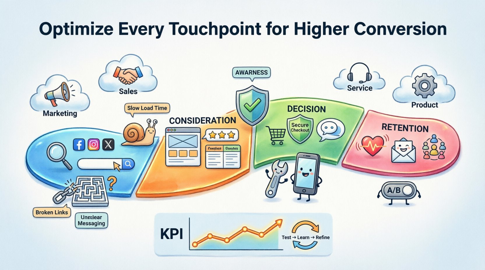
Understanding the Digital Footprint 🦶
A touchpoint is any point of contact between a customer and a brand. While this traditionally included in-store visits or phone calls, the digital age has expanded this definition significantly. Every click, scroll, email open, and customer service chat constitutes a data point that can be optimized.
When you map these touchpoints, you are essentially creating a visual representation of the user’s path. This process reveals where users feel confident and where they encounter resistance. The goal is to ensure that the journey is logical, transparent, and supportive.
Categories of Touchpoints
To optimize effectively, you must first categorize the interactions. These generally fall into four distinct buckets:
- Marketing Touchpoints: Ads, social media posts, blog articles, and newsletters designed to attract attention.
- Sales Touchpoints: Landing pages, product demos, pricing pages, and checkout flows.
- Service Touchpoints: Customer support tickets, live chat, and onboarding emails.
- Product Touchpoints: The actual usage of the service or product itself, including user interface design and performance.
Each category serves a specific purpose in the funnel. Marketing builds awareness, sales drives intent, service builds trust, and product ensures retention. Ignoring any one of these creates a gap in the experience that can lead to abandonment.
The Anatomy of a High-Converting Journey 🧩
A successful journey mapping exercise requires a deep dive into the customer lifecycle. We can break this lifecycle down into four primary stages. For each stage, specific touchpoints carry more weight than others.
| Stage | Primary Goal | Key Touchpoints | Optimization Focus |
|---|---|---|---|
| Awareness | Discovery | Social Ads, Search Results, Content | Relevance and Clarity |
| Consideration | Evaluation | Landing Pages, Reviews, Comparisons | Trust and Information Density |
| Decision | Transaction | Checkout, Pricing, Support Chat | Friction Reduction |
| Retention | Loyalty | Onboarding, Follow-up Emails, Community | Value Reinforcement |
Notice that the optimization focus shifts as the customer moves deeper into the funnel. Early stages require broad appeal and accurate messaging. Later stages demand precision and speed. A mismatch here, such as a slow loading speed on a pricing page, can derail a conversion that was previously assured.
Identifying Friction Points 🛑
Friction is the enemy of conversion. It is any obstacle that prevents the user from moving to the next step. Friction can be technical, psychological, or process-oriented. Identifying these points requires a combination of quantitative data and qualitative feedback.
Technical Friction
These are tangible barriers within the digital infrastructure. Common examples include:
- Page Load Speed: Every second of delay increases bounce rates significantly.
- Mobile Responsiveness: If a site does not render correctly on smartphones, a large portion of traffic is lost.
- Broken Links: A 404 error creates confusion and breaks the flow of trust.
- Form Complexity: Asking for too much information upfront creates resistance.
Psychological Friction
These barriers exist in the user’s mind. They are often more difficult to detect but equally damaging.
- Lack of Clarity: If the value proposition is vague, users hesitate.
- Trust Deficits: Missing security badges or privacy policies can trigger anxiety.
- Choice Overload: Presenting too many options can lead to decision paralysis.
- Hidden Costs: Unexpected fees at the end of a checkout process are a primary cause of cart abandonment.
To find these friction points, analyze drop-off rates. If 50% of users enter the checkout flow but only 20% complete it, the issue lies between the cart page and the confirmation screen. Heatmaps can show where users click or stop scrolling. Session recordings allow you to watch the struggle firsthand.
Actionable Strategies for Optimization 🛠️
Once you have identified the friction points and mapped the journey, you can begin the optimization process. This requires a shift from intuition to evidence-based changes.
1. Refine Messaging for Context
Context is king. The message a user sees at the top of a blog post should differ from the message on a checkout button. When a user arrives from a search query about “affordable solutions,” they need to see pricing transparency immediately. When they arrive from a brand awareness campaign, they need to see the broader vision.
- Align Copy with Intent: Ensure the headline matches the promise made in the ad or search result.
- Reduce Cognitive Load: Use plain language. Avoid jargon that requires the user to think hard.
- Highlight Benefits: Focus on what the user gains, not just what the product does.
2. Streamline Navigation and Layout
A cluttered interface confuses users. A clean layout guides them. Use whitespace effectively to draw attention to primary actions. Group related information together so users do not have to jump between sections to find answers.
- Visual Hierarchy: Use size, color, and contrast to indicate importance. The most important action should be the most prominent.
- Consistent Navigation: Keep menus predictable. Users should not have to learn a new layout for every page.
- Clear Call-to-Action (CTA): Buttons should be descriptive (e.g., “Start Free Trial” rather than “Submit”).
3. Enhance Trust Signals
Trust is the currency of conversion. Without it, even the best product will fail to sell. You must make the user feel safe at every touchpoint.
- Social Proof: Display testimonials, case studies, and user counts prominently.
- Security Indicators: Show SSL certificates and secure payment icons near the checkout form.
- Transparency: Clearly state return policies, shipping times, and data usage practices.
4. Optimize for Mobile-First
With mobile traffic often exceeding desktop usage, a mobile-optimized experience is non-negotiable. This goes beyond just resizing images.
- Touch Targets: Buttons and links must be large enough to tap accurately with a thumb.
- Input Fields: Use appropriate keyboard types (e.g., number pad for phone numbers) to speed up entry.
- Reduced Friction: Implement autofill and guest checkout options to minimize typing.
Measuring Impact and Iterating 📈
Optimization is not a one-time event. It is a continuous cycle of testing, learning, and refining. You must define what success looks like before making changes.
Key Performance Indicators (KPIs)
While conversion rate is the obvious metric, it does not tell the whole story. You should track a suite of metrics to understand the health of your touchpoints.
- Conversion Rate: The percentage of users who complete the desired action.
- Bounce Rate: The percentage of users who leave after viewing only one page.
- Average Session Duration: Indicates engagement levels.
- Cart Abandonment Rate: Specifically for e-commerce, highlights checkout friction.
- Customer Lifetime Value (CLV): Measures the long-term value of a converted user.
The Testing Cycle
Never assume a change is better without proof. Use A/B testing to compare variations of a page or process.
- Formulate a Hypothesis: “Changing the button color to blue will increase clicks because it stands out more against the background.”
- Create a Variation: Build the version of the page with the blue button.
- Split Traffic: Direct a portion of users to the original and a portion to the variation.
- Analyze Results: Determine if the variation performed significantly better.
- Implement: Roll out the winning version to all users.
Remember that data can sometimes be misleading. If conversion rates go up but average order value goes down, you may be optimizing for the wrong goal. Always look at the broader business impact.
Integrating Offline and Online Channels 🔄
For many businesses, the journey is not purely digital. A customer might see an ad online, research the product in a store, and then buy online. This is known as the omnichannel experience. Optimizing touchpoints now requires bridging the gap between physical and digital worlds.
- Consistent Branding: Ensure the tone, colors, and messaging match across the website and the physical location.
- Inventory Visibility: Allow users to check real-time stock availability online before visiting a store.
- Click-and-Collect: Enable users to buy online and pick up in-store, which often leads to additional purchases.
- Staff Training: Ensure in-store staff are aware of digital promotions and can assist with online account issues.
When these channels work in harmony, the customer feels supported rather than confused. If a user sees a discount code on their phone, they should be able to use it immediately at the register. This seamless integration reinforces the brand’s reliability.
Common Mistakes That Reduce Conversion 🚫
Even with the best intentions, businesses often make errors that hinder performance. Being aware of these pitfalls can save significant time and resources.
- Ignoring User Feedback: Just because a metric looks good doesn’t mean the user is happy. Use surveys and feedback forms to get direct input.
- Over-Optimizing for One Metric: Focusing solely on clicks can lead to low-quality traffic. Focus on qualified leads and sales.
- Changing Too Much at Once: If you update the header, footer, and product page simultaneously, you will not know which change caused the shift in data.
- Neglecting Post-Purchase: The journey does not end at checkout. The confirmation email and delivery experience are critical for retention and referrals.
- Assuming One Size Fits All: Different customer segments may have different journeys. A first-time visitor has different needs than a returning customer.
Building a Culture of Optimization 🏗️
Finally, optimization should not be siloed within a single department. It requires a company-wide commitment to the customer experience. Marketing, sales, support, and product teams must share data and insights.
When support knows why a user abandoned a cart, they can proactively reach out. When product knows where users drop off, they can fix the interface. When marketing knows which channels bring the best quality users, they can allocate budget more efficiently.
- Share Data Regularly: Hold cross-functional meetings to review journey metrics.
- Create User Personas: Ensure all teams understand who they are serving.
- Empower Frontline Staff: Give support and sales teams the authority to solve problems without excessive bureaucracy.
By treating every interaction as a data point and an opportunity to build trust, you create a resilient business model. The goal is not to trick users into buying, but to make the buying process so smooth that it feels natural.
Final Thoughts on Journey Refinement 🌟
Optimizing touchpoints is a marathon, not a sprint. It requires patience, discipline, and a genuine desire to understand the user. As you implement these strategies, you will likely find that small tweaks compound over time. A faster load time here, a clearer headline there, a simpler form somewhere else. Together, these changes create a powerful ecosystem that converts visitors into loyal advocates.
Start by auditing your current journey. Identify the top three friction points. Pick one to fix this week. Measure the results. Repeat. This iterative approach ensures continuous improvement without overwhelming your resources. The market will always change, but the fundamental need for clarity and ease remains constant. Focus on that, and your conversion rates will follow.