管理商业战略常常感觉像是在拼一个缺少部分的拼图。你有远大的目标,但通往目标的路径依然模糊不清。这个AI驱动的KPI绩效图构建工具来自Visual Paradigm改变了这一局面。这个在线KPI制作工具将复杂的商业计划转化为清晰的可视化地图。它将你的日常任务与高层次的财务目标直接关联。如果你想确切了解你的营销努力如何影响你的账户余额,这个专业绩效映射应用就是解决方案。它利用智能技术帮助你可视化成功,而无需承受手动数据输入的常见困扰。
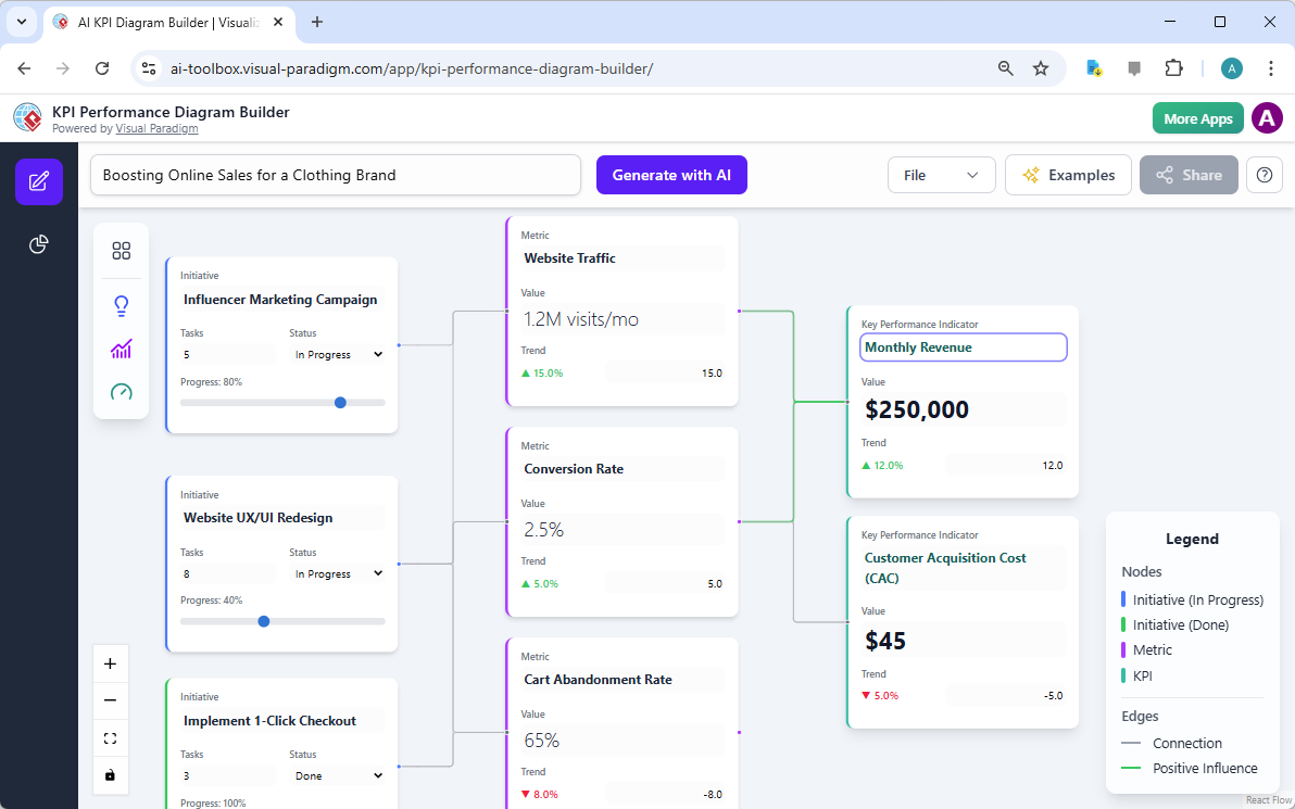
在第一个视觉示例中,我们看到一个服装品牌的策略地图。用户输入了一个简单目标:“提升服装品牌的在线销售额”。随后,AI生成了完整的举措、指标和关键绩效指标生态系统。布局清晰地展示了“影响者营销活动”如何推动“网站流量”。它还展示了“网站用户体验/界面重新设计”如何提升“转化率”。所有这些要素都汇聚到最终目标:“月收入”。该图表使用绿色线条表示这些不同节点之间的正向影响。
快速概览:为什么战略可视化至关重要
-
视觉清晰度:清晰地看到小任务如何影响大业务目标。
-
AI生成:停止盯着空白屏幕,让AI帮你生成初稿。
-
数据驱动洞察:获取关于风险和绩效趋势的自动报告。
-
无缝协作:通过一个简单且安全的网络链接分享你的策略。
-
专业导出:为你的下一次董事会会议创建高质量的图像。
理解你策略的核心组成部分
要使用这个最佳易用KPI工具,你必须理解三个基本术语。首先是举措。这是你当前正在进行的特定项目或任务。在我们的服装品牌示例中,“实现一键结账”就是一个举措。这是为改善业务而采取的具体行动。这些节点有助于团队专注于需要完成的任务。该工具会自动跟踪这些任务的状态和进度。你可以一眼看出一个项目是“进行中”还是“已完成”。
第二个组成部分是指标一个指标是针对特定活动的测量单位。它能告诉你你的举措是否真正有效。例如,“购物车放弃率”是零售业的一个关键指标。如果这个数字下降,说明你的1键结账举措很可能成功了。专业KPI软件以趋势百分比清晰地显示这些数值。一个向下指的红色箭头可能意味着某个指标正在下降,这有助于你及早发现问题。这种详细程度确保每个人对其工作领域的具体职责负责。
最后一步是KPI(关键绩效指标)。这是您业务的最高层级测量标准。它代表您的最终目标,例如“月收入”或“客户获取成本”。KPI受多个指标的影响。如果您的网站流量和转化率上升,您的收入KPI也会随之上升。在线绩效仪表板软件使这些关系变得一目了然。你不再需要猜测收入变化的原因。你可以通过指标和举措回溯路径,找到根本原因。
利用人工智能解决空白画布难题
从零开始制定战略往往是管理中最困难的部分。这个由人工智能驱动的战略可视化工具彻底消除了这一障碍。你只需为项目提供一个名称,人工智能便会建议一个逻辑清晰的举措与指标框架。它就像一位智能顾问,几秒钟内就能勾勒出计划。你可以拖拽这些节点来自定义布局。画布由React Flow驱动,使其流畅且互动性强。随着你的业务战略不断发展,你可以随时添加、删除或重新连接节点。
人工智能不仅绘制方框和箭头,还能为任何你创建的举措建议具体的指标。如果你新增一个“社交媒体互动”项目,人工智能可以建议追踪“分享率”或“每帖评论数”。这确保你不会遗漏任何关键数据点。它帮助你构建一个全面的框架,涵盖运营的各个方面。这个最佳专业KPI编辑器将复杂的规划阶段转变为快速而富有创意的过程。它让领导者能够专注于决策,而不是绘制图表。
通过AI洞察生成可操作的智能
图表非常适合可视化,但数据需要经过分析才能发挥作用。这个易于使用的KPI绩效图表构建器包含强大的“AI洞察”功能。该部分将你的可视化数据转化为文字报告。你可以生成一份“执行摘要”,快速了解整体状况。如果你需要更深入的分析,可查看“绩效分析”报告,它能识别趋势和模式。这些报告采用Markdown格式,便于阅读和分享。它们揭示了屏幕上数字背后的“原因”。
风险评估是AI洞察标签页中的另一项关键功能。该工具分析你当前的图表,以发现潜在的脆弱点。它可能会发现你的收入过度依赖单一营销渠道。及早识别这些风险,有助于你制定应对策略。你还可以生成一份“团队绩效报告”,深入分析特定举措。这有助于管理者了解哪些团队达成了目标,哪些需要更多支持。它使你的绩效地图成为推动业务增长的动态文档。
与你的全球团队协作
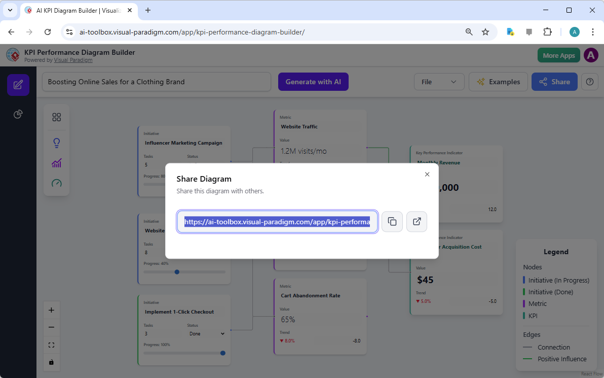
战略是一项团队运动,而沟通是取胜的关键。这个在线KPI制作工具简化了你与他人分享愿景的方式。一旦你将项目保存到云端,就可以生成一个独特的共享链接。任何拥有该URL的人都可以查看你的交互式图表。这非常适合向没有该软件的客户或利益相关者展示。他们可以浏览节点并查看关系,而不会意外更改你的工作。它为整个组织创建了一个“唯一真实来源”。
在第二个视觉参考中,显示了“分享图表”界面。它提供一个可一键复制的直接链接。此功能确保从CEO到市场实习生的每个人都保持一致。你还可以在新标签页中打开该链接,查看它对你的受众呈现的效果。这种透明度促进了各部门之间的更好协同。当每个人都看到同一张地图时,他们就能理解自己的工作如何贡献于整体大局。分享你的战略愿景从未如此高效。
本地与云端项目管理
数据安全与可访问性是任何现代企业的首要任务。这个专业KPI软件提供灵活的项目管理选项。你可以将工作直接保存到云端,以便通过任何联网设备访问。这意味着你可以在办公室开始绘制图表,然后在家完成。如果你更倾向于将文件保存在自己的设备上,可以将项目导出为JSON文件。该文件之后可重新导入工具,确保你的数据始终由你掌控。
在演示和文档方面,该工具提供高质量的PNG导出选项。这将你的复杂绩效地图转化为适用于幻灯片或报告的专业图像。自动布局功能确保导出的图像整洁有序。它会自动排列节点,避免重叠和混乱的连接。这节省了数小时的手动调整和对齐工作。无论你使用云端还是本地文件,你的战略数据始终保持有序,随时可行动。
结论:立即转变您的绩效战略
该AI驱动的KPI绩效图构建工具对业务领导者而言是一次变革。它弥合了高层目标与日常运营之间的差距。通过使用AI生成框架和洞察,您可节省时间并减少错误。该工具的可视化特性使复杂的战略对每个人来说都易于理解。无论您是业务战略家、项目经理还是顾问,此工具都能为您提供所需的清晰度。它将原始数据转化为成功与增长的视觉故事。
停止在静态电子表格和脱节计划中挣扎。开始构建真正有效的动态、数据驱动的战略。您可以通过启动构建工具并输入项目领域来开始。让AI生成您的第一个图表,见证您的战略焕发活力。为了体验战略可视化的力量,请访问官方工具页面,立即开始创建。是时候借助业界最优秀的在线KPI制作工具.
立即试用AI驱动的KPI绩效图构建工具: 启动应用程序
了解我们创新工具的更多信息: 访问信息页面
相关链接
Visual Paradigm 提供专门用于KPI(关键绩效指标)管理与绩效可视化,利用AI驱动的构建工具创建实时仪表板和战略框架以使指标与组织目标保持一致。
-
AI驱动的KPI绩效图构建工具全面指南:本指南详细介绍了如何使用AI驱动的工具构建动态、实时图表以支持数据驱动的商业智能。
-
理解咖啡店的AI驱动KPI绩效图:一项实际应用研究,展示了如何中小企业可以跟踪销售、客户行为以及运营效率,通过KPI仪表板实现。
-
战略地图工具——可视化您组织的战略目标: 该工具可实现可视化战略地图 直接将业务目标与特定关键绩效指标 及举措。
-
用于战略规划的AI驱动平衡计分卡软件: 学习如何利用AI洞察 来制定监控绩效指标 战略执行所必需的。
-
AI业务流程改进工具 – 发布说明: 此次更新引入了一款AI工具,可从初始流程问题陈述自动生成图表和关键绩效指标。
-
为什么Visual Paradigm Online的翻页书制作工具脱颖而出: 除了发布功能外,该工具还旨在创建交互式报告 和视觉上引人入胜的关键绩效指标演示 以供利益相关者使用。
-
雷达图工具 – Visual Paradigm功能: 用于构建交互式雷达图 以分析和比较复杂、多维度的绩效数据.
-
AI图表生成器新增雷达图支持: 此次发布强调利用AI生成图表以可视化能力指标 以及绩效趋势。
-
流程改进工具 – 建模与分析:一个数据驱动的工具集 旨在通过分析集成的绩效指标.
-
如何使用雷达图进行竞争分析:本教程提供了一个使用雷达图来评估竞争对手 在各种与绩效相关的维度上。