In the digital landscape, the distinction between user experience (UX) and conversion metrics is often blurred by teams that view them as separate disciplines. Designers focus on aesthetics and flow, while analysts focus on data points and outcomes. However, true growth comes from understanding that every pixel and every interaction drives a measurable business result. This guide explores how to integrate customer journey mapping with conversion data to create a cohesive strategy that improves both satisfaction and revenue.
When you align these two areas, you move beyond guessing what users want. You gain clarity on exactly where they struggle, why they leave, and what nudges them to complete a desired action. This alignment requires a methodical approach to data collection, visualization, and iterative testing. By treating the user journey as a series of measurable checkpoints, organizations can make informed decisions that respect the user while achieving business goals.
Why UX and Conversion Metrics Are Inseparable 🔗
Many organizations operate with a siloed mindset. Marketing teams optimize for clicks, while product teams optimize for usability. This disconnect leads to a fragmented experience where the path to conversion is fraught with confusion. When you connect UX directly to conversion metrics, you create a feedback loop that informs design decisions with hard evidence.
- Data-Driven Design: Instead of relying on intuition, design changes are based on how users actually behave within the system.
- Reduced Friction: Identifying drop-off points allows teams to remove barriers that prevent completion of tasks.
- Improved ROI: Resources are allocated to areas that directly impact the bottom line rather than cosmetic tweaks.
- User Retention: A smooth experience leads to higher satisfaction, which correlates with long-term loyalty.
Consider a scenario where a checkout form is visually appealing but requires too many steps. A designer might see this as a success because it looks good. An analyst sees a high abandonment rate. Combining these views reveals that the design is prioritizing style over function, causing revenue loss. The solution is to streamline the input fields while maintaining the visual brand identity.
Defining Key Conversion Metrics in a Digital Context 🎯
To effectively link experience to outcomes, you must first understand the metrics that matter. Not all data points are equal. Some indicate interest, while others indicate intent. Focusing on the right indicators prevents analysis paralysis.
Primary Conversion Indicators
- Conversion Rate: The percentage of users who complete a specific goal out of the total number of visitors.
- Average Order Value (AOV): The average amount spent each time a customer completes a purchase.
- Cart Abandonment Rate: The percentage of users who add items to a cart but do not finish the purchase.
- Time on Page: How long a user stays on a specific piece of content before navigating away.
- Bounce Rate: The percentage of visitors who leave after viewing only one page.
Secondary Experience Indicators
While the metrics above track business outcomes, these indicators track the quality of the interaction itself:
- Click-Through Rate (CTR): How often users click on a specific link or call-to-action.
- Task Success Rate: The percentage of users who successfully complete a task without assistance.
- Error Rate: How often users encounter validation errors or broken links.
- Scroll Depth: How far down a page a user scrolls before leaving.
Understanding the relationship between these two sets of data is critical. For example, a high bounce rate on a landing page might indicate a slow load time (a technical UX issue) or irrelevant content (a copy issue). Without distinguishing between these causes, optimization efforts may fail.
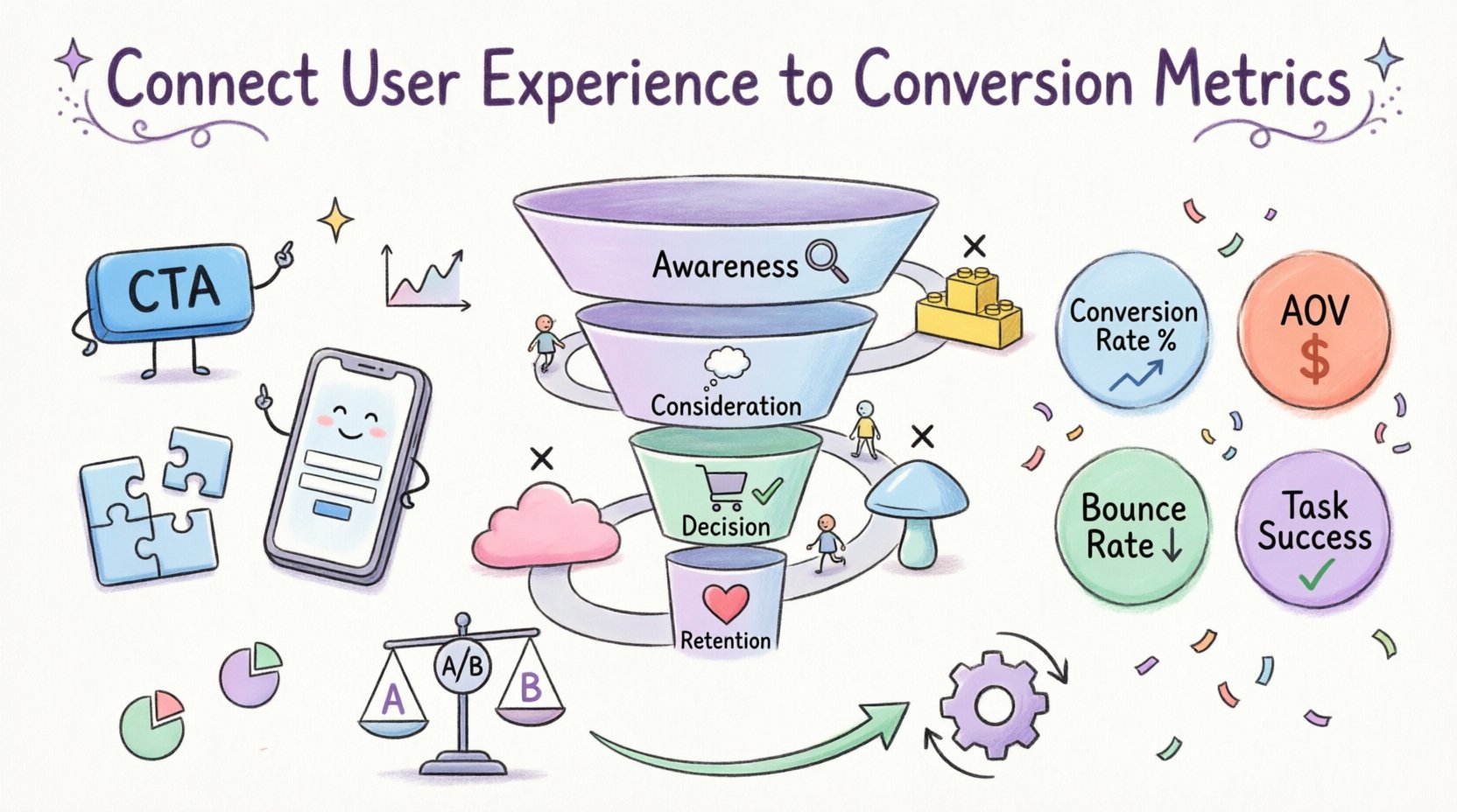
The Customer Journey Mapping Process 🗺️
A customer journey map is a visual representation of every point of contact a user has with your organization. It is not just a diagram; it is a tool for empathy and analysis. By overlaying conversion metrics onto this map, you can see the health of each stage of the funnel.
Stage 1: Awareness
This is where users first discover your brand. The goal is to attract the right audience. Metrics here include traffic sources and initial engagement.
- UX Focus: Landing page relevance, load speed, and clear messaging.
- Metrics: Impressions, Click-Through Rate, Bounce Rate.
Stage 2: Consideration
Users are evaluating your solution against others. They need information to build trust.
- UX Focus: Navigation ease, content clarity, and accessibility of support.
- Metrics: Pages per session, Time on Page, Scroll Depth.
Stage 3: Decision
The user is ready to take action. This is the most critical stage for conversion optimization.
- UX Focus: Checkout flow, form simplicity, and payment options.
- Metrics: Conversion Rate, Cart Abandonment Rate, Form Completion Rate.
Stage 4: Retention
The journey does not end at purchase. Post-purchase experience drives repeat business.
- UX Focus: Account management, support accessibility, and personalization.
- Metrics: Repeat Purchase Rate, Customer Lifetime Value, Net Promoter Score.
Mapping Metrics to UX Elements 📊
To make this actionable, specific user interface elements must be tied to specific metrics. This table provides a framework for that alignment.
| UX Element | Associated Metric | Impact on Conversion |
|---|---|---|
| Call-to-Action Button | Click-Through Rate | Higher visibility and contrast increase clicks. |
| Form Fields | Form Completion Rate | Reducing fields lowers friction and increases submission. |
| Page Load Speed | Bounce Rate | Faster loads reduce immediate departures. |
| Product Descriptions | Time on Page | Rich content keeps users engaged longer. |
| Search Functionality | Exit Rate | Effective search prevents users from leaving without results. |
| Mobile Responsiveness | Mobile Conversion Rate | Optimized layouts for small screens boost mobile sales. |
Identifying Friction Points in the Flow 🛑
Friction is anything that slows down or stops a user from achieving their goal. It is the enemy of conversion. Identifying these points requires looking at where users drop off in the journey map.
- Unexpected Costs: If shipping costs appear only at the end of checkout, users often abandon the cart.
- Complex Navigation: If a user cannot find a category within three clicks, they are likely to leave.
- Confusing Copy: Jargon or vague instructions can lead to hesitation and errors.
- Technical Errors: Broken links or slow servers create a negative first impression.
- Forced Registration: Requiring an account before purchasing creates a high barrier to entry.
When you detect a drop-off, do not assume the cause. Use session recording tools or heatmaps to observe behavior. Did they click a button that did not work? Did they scroll past the offer entirely? Did they hesitate before typing in a password?
Qualitative vs. Quantitative Data Integration 📊
Numbers tell you what is happening. Stories tell you why. Relying solely on quantitative data leaves you guessing about user motivation. Relying solely on qualitative data leaves you with anecdotes that may not represent the whole population.
Quantitative Data
This is the hard data collected through tracking systems. It provides scale and statistical significance.
- Volume: How many users are affected by an issue?
- Trends: Is the problem getting better or worse over time?
- Segmentation: How do different user groups behave differently?
Qualitative Data
This is the feedback gathered from direct interaction with users. It provides context and depth.
- Surveys: Asking users directly about their satisfaction or confusion.
- User Testing: Observing users as they attempt to complete tasks.
- Support Logs: Reviewing tickets to see what questions or issues arise most frequently.
- Interviews: Deep dives into user motivations and pain points.
Integrating these two sources creates a complete picture. For instance, quantitative data might show a high drop-off on a pricing page. Qualitative data from a survey might reveal that users are confused by the tier comparison. Combining these insights leads to a redesign of the pricing table for clarity.
Optimization Strategies Based on Insights 🔧
Once you have identified the gaps between user experience and conversion goals, you can begin optimization. This is not a one-time fix but a continuous process of improvement.
- A/B Testing: Test two versions of a page to see which performs better against a specific metric.
- Iterative Design: Make small changes frequently rather than large overhauls occasionally.
- Personalization: Show content relevant to the user’s stage in the journey or past behavior.
- Accessibility Improvements: Ensuring the site works for all users, including those with disabilities, expands your potential market.
- Speed Optimization: Compress images and minimize code to reduce load times.
When optimizing, always measure the impact. If you change a button color to increase clicks, verify that it does not negatively impact the conversion rate or increase bounce rates elsewhere.
Measuring Success Over Time 📅
Success is not a single event. It is a trajectory. You need to establish baselines before making changes so you can measure progress accurately.
- Set Benchmarks: Define what success looks like for your specific industry and goals.
- Track Trends: Look at data over weeks or months to account for seasonality.
- Monitor Core Web Vitals: Keep an eye on loading performance, interactivity, and visual stability.
- Review Goals: Regularly reassess if the original conversion goals are still relevant.
It is also important to monitor for negative side effects. Sometimes optimizing for one metric hurts another. For example, aggressive pop-ups might increase email sign-ups but decrease overall time on site.
Common Mistakes in Alignment ❌
Even with the best intentions, teams often stumble when trying to connect UX and conversion data. Being aware of these pitfalls helps you avoid them.
- Focus on Vanity Metrics: Tracking likes or shares instead of actions that drive revenue.
- Ignoring Mobile Users: Designing only for desktop and assuming mobile users behave the same way.
- Changing Too Much at Once: Making multiple simultaneous changes makes it impossible to know which one caused a shift in data.
- Neglecting Load Times: Assuming users have fast connections and ignoring performance optimization.
- Assuming Intent: Assuming a user knows what to do without testing if they actually understand the interface.
The Role of Mobile Experience 📱
Mobile devices account for a significant portion of web traffic. If your journey mapping does not account for mobile, your conversion data will be skewed. Mobile users have different behaviors than desktop users.
- Thumb Zone: Place important actions within easy reach of the thumb.
- Touch Targets: Ensure buttons are large enough to be tapped accurately.
- Form Input: Use appropriate keyboards for different data types (e.g., number pad for phone numbers).
- Screen Real Estate: Prioritize content that needs to be seen first, as space is limited.
Ignoring mobile optimization often leads to high bounce rates on that device segment, even if desktop users are converting well.
Future Considerations in UX Analytics 🚀
The landscape of digital experience is constantly evolving. As technology advances, so do the methods for measuring and improving user experience.
- AI and Predictive Analytics: Using machine learning to predict user behavior before it happens.
- Voice Search: Optimizing for voice queries changes how users search and find content.
- Augmented Reality: Allowing users to visualize products before buying can reduce returns and increase confidence.
- Privacy Regulations: As data privacy laws tighten, methods for tracking must adapt to remain compliant while still providing insights.
Staying ahead of these trends ensures that your connection between UX and conversion metrics remains robust and relevant. It requires a commitment to learning and adapting your strategies as the digital environment shifts.
Building a Culture of Continuous Improvement 🏗️
Ultimately, connecting user experience to conversion metrics is not just a technical task; it is a cultural one. It requires collaboration between designers, developers, analysts, and stakeholders. Everyone must understand that the user’s journey is the primary driver of business success.
- Shared Goals: Ensure all teams are working towards the same conversion targets.
- Regular Reviews: Hold meetings to review data and discuss findings.
- User Advocacy: Keep the user at the center of every decision.
- Transparency: Share data openly across teams to build trust and alignment.
By fostering this environment, you create a system where insights lead to action, and action leads to measurable results. This cycle of improvement is the foundation of a sustainable digital strategy.