


In the world of software development, data drives decision-making. For years, teams have relied on a handful of familiar numbers to gauge their progress. Velocity and burndown charts are the staples of the agile toolkit. They tell you how much work is getting done and if you are on track to finish a sprint. However, relying solely on these indicators creates a blind spot. They measure activity, not value. They measure output, not outcome.
To truly understand team health and product success, we must look deeper. This guide explores advanced user story metrics that offer a clearer picture of flow, quality, and predictability. We will move past simple counting and start measuring what actually matters for sustainable delivery.
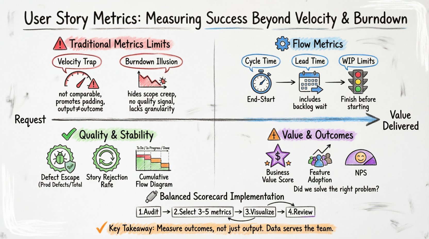
🚫 The Limits of Traditional Metrics
Velocity is defined as the amount of work a team completes in a single iteration. Burndown charts show the remaining work over time. While useful for short-term planning, they suffer from significant drawbacks when used as the primary measure of success.
1. The Velocity Trap
- Not Comparable Across Teams: Team A might estimate a story as 5 points, while Team B estimates the same story as 3 points. Comparing their velocities is meaningless.
- Promotes Padding: If velocity is the goal, teams may inflate story point estimates to create a buffer. This inflates the metric without adding real value.
- Focuses on Output, Not Outcome: A team can have high velocity by completing many small, low-value tasks. They might deliver code that users do not need or that introduces technical debt.
- Encourages Gaming the System: Teams might split stories artificially just to increase the count of completed items, rather than focusing on the delivery of a cohesive feature.
2. The Burndown Illusion
- Hides Scope Creep: A flat burndown line might look like a problem, but it could mean new work was added to balance the removed work. The chart does not always show the context of why the line stayed flat.
- Does Not Measure Quality: A burndown chart reaches zero even if the work contains bugs. The line does not track how many times work was rejected due to quality issues.
- Lack of Granularity: It aggregates all work into a single number. It cannot distinguish between a critical bug fix and a minor UI tweak.
When you rely only on these metrics, you risk optimizing for the chart rather than the product. You need metrics that reveal the health of the process itself.
⚙️ Flow Metrics: Understanding the Journey
Flow metrics focus on the movement of work through the system. They help identify bottlenecks and measure efficiency. These metrics are essential for understanding how quickly value reaches the user.
1. Cycle Time
Cycle time measures the elapsed time from when work on a user story actually begins until it is ready for release. Unlike velocity, which looks at output volume, cycle time looks at speed.
- Why it matters: Shorter cycle times generally lead to faster feedback loops. If a team can move a story from “In Progress” to “Done” quickly, they can validate assumptions sooner.
- How to calculate: Subtract the start date from the completion date.
- Target: Look for trends. A decreasing cycle time indicates improved efficiency. An increasing cycle time signals a bottleneck.
2. Lead Time
Lead time is the total time from when a request is made (or a story is created) until it is delivered. It includes the waiting time before work even starts.
- Why it matters: This is the metric that customers actually experience. It measures the total responsiveness of the organization.
- Distinction: Lead time includes the backlog wait time. Cycle time does not.
- Impact: Reducing lead time improves customer satisfaction and allows for faster market adaptation.
3. Work In Progress (WIP)
WIP limits the number of stories being worked on simultaneously. Limiting WIP forces focus and completion.
- Context Switching: High WPI leads to context switching, which reduces cognitive performance.
- Bottleneck Identification: If WIP is high but completion is low, work is stuck somewhere in the pipeline.
- Strategy: Establishing WIP limits encourages the team to finish one story before starting another.
🎯 Quality and Stability Metrics
Speed without quality is a liability. Teams must measure the stability of their delivery to ensure that velocity does not come at the cost of technical health.
1. Defect Escape Rate
This metric tracks how many defects are found by users or in production compared to those found during testing.
- Calculation: (Defects in Production / Total Defects Found) * 100.
- Goal: A lower percentage indicates better testing coverage and earlier bug detection.
- Risk: A high rate suggests that quality gates are being bypassed or testing is insufficient.
2. Story Rejection Rate
How often does a story fail the acceptance criteria and get sent back to development?
- Implication: A high rejection rate indicates poor communication between product owners and developers.
- Root Cause: It may also mean acceptance criteria are unclear or the definition of done is inconsistent.
- Benefit: Tracking this helps refine the refinement process and clarify requirements before work begins.
3. Cumulative Flow Diagram (CFD)
A visual representation of the workflow states over time. It shows the volume of work in each stage (e.g., To Do, In Progress, Done).
- Analysis: If the “In Progress” band widens, work is piling up. If the “Done” band is narrow, throughput is low.
- Visibility: It provides a holistic view of the system’s capacity and constraints.
💰 Value and Outcome Metrics
Ultimately, software exists to solve problems. Metrics should reflect the value delivered, not just the code written.
1. Business Value Delivered
Assigning a value score to user stories helps prioritize work that matters most. This can be done by stakeholders using a simple scoring model.
- Scoring Model: Rate stories based on revenue impact, user satisfaction, or strategic alignment.
- Tracking: Sum the value scores of completed stories per sprint or quarter.
- Shift: This moves the conversation from “How many points did we finish?” to “How much value did we generate?”
2. Feature Adoption Rate
Once a story is in production, is anyone using it?
- Measurement: Track active users or usage frequency of the specific feature.
- Feedback: Low adoption indicates a feature might not be needed or is hard to use.
- Iteration: Data here informs whether to invest more in a feature or kill it.
3. Net Promoter Score (NPS)
While not a story-level metric, NPS tracks overall customer sentiment. It correlates with the quality of the stories delivered.
- Connection: If NPS drops while velocity rises, something is wrong with the quality or relevance of the work.
- Alignment: It aligns the development team with business goals regarding customer satisfaction.
📋 Comparison of Key Metrics
Understanding when to use each metric is crucial. The table below summarizes the purpose, calculation, and focus area for each category.
| Metric | Focus Area | Calculation | Primary Use |
|---|---|---|---|
| Velocity | Capacity Planning | Sum of story points completed | Forecasting sprint capacity |
| Cycle Time | Efficiency | Completion Date – Start Date | Identifying bottlenecks |
| Lead Time | Responsiveness | Delivery Date – Request Date | Customer experience measurement |
| Defect Escape Rate | Quality | Prod Defects / Total Defects | Assessing testing effectiveness |
| WIP Count | Focus | Count of active items | Managing multitasking |
| Value Score | Impact | Stakeholder Rating | Prioritizing high-impact work |
🛠️ Implementing a Balanced Scorecard
Adopting these metrics requires a shift in mindset. It is not about adding more tracking; it is about tracking the right things. Here is a step-by-step approach to implementing a balanced view.
1. Audit Current Metrics
- Review what data is currently being reported to leadership.
- Identify which metrics are driving behavior.
- Ask: “Are we optimizing for the metric or the outcome?”
2. Select a Core Set
- Do not try to measure everything at once. Select 3 to 5 key metrics.
- Choose one from each category: Flow, Quality, and Value.
- Ensure the team agrees on the definitions and calculation methods.
3. Visualize Transparency
- Display metrics where the team can see them daily.
- Use dashboards that update automatically.
- Avoid using metrics for individual performance reviews. Focus on team performance.
4. Review Regularly
- Discuss metrics in retrospective meetings.
- Ask: “What does this data tell us about our process?”
- Adjust the process based on the insights, not just the numbers.
⚠️ Common Pitfalls to Avoid
Even with good intentions, metric implementation can go wrong. Watch out for these common traps.
- Goodhart’s Law: When a measure becomes a target, it ceases to be a good measure. If you tie bonuses to velocity, you will game velocity.
- Data Overload: Collecting too much data creates noise. Focus on actionable insights.
- Ignoring Context: A spike in cycle time might be due to a complex project, not team inefficiency. Always investigate the “why” behind the numbers.
- Tool Dependency: Do not let the limitations of your tracking system dictate what you measure. If you cannot measure value because the tool doesn’t support it, find a manual way to do it.
🧠 Team Health and Predictability
Beyond the technical metrics, the human element of the team dictates long-term success. Metrics that reflect team stability are vital.
1. Predictability Index
This measures how accurately the team estimates what they can do versus what they actually do.
- Calculation: Compare committed story points to completed story points.
- Benefit: High predictability builds trust with stakeholders.
- Goal: Aim for consistency rather than maximum output.
2. Team Satisfaction
Use surveys to measure morale and engagement.
- Correlation: Satisfied teams tend to have lower turnover and higher quality output.
- Frequency: Conduct these surveys quarterly.
- Action: If scores drop, investigate workload, blockers, or process friction.
3. Knowledge Distribution
Track how many people are capable of working on specific areas of the codebase.
- Bus Factor: If only one person knows a module, that is a risk.
- Metrics: Count the number of unique contributors per module over time.
- Improvement: Encourage pair programming and cross-training to spread knowledge.
🔄 Continuous Improvement
Metrics are not a destination; they are a compass. The goal is continuous improvement. As the team matures, the metrics should evolve.
- Phase 1: Transparency. Get data visible. Understand what is happening.
- Phase 2: Optimization. Use data to reduce waste and improve flow.
- Phase 3: Value. Shift focus to business outcomes and customer impact.
By diversifying the metrics used, teams can avoid the pitfalls of single-metric obsession. Velocity and burndown have their place, but they are only part of the story. Flow metrics reveal efficiency. Quality metrics reveal stability. Value metrics reveal impact.
Combining these perspectives creates a robust view of team performance. It allows leaders to make informed decisions without micromanaging. It allows teams to take ownership of their process without fear of judgment.
Start by picking one new metric to track. Observe it for a month. Discuss what it reveals. Then add another. Build a culture where data serves the team, not the other way around. This is the path to sustainable, high-performing delivery.