


Conversion is not a magical event; it is the result of a carefully engineered path. When users visit a digital property, they are looking for a solution, an answer, or a product. They carry intent, but that intent is fragile. Every second they spend navigating, every question they have to answer twice, and every moment of doubt they feel chips away at that intent. These moments are friction points. They are the invisible walls standing between a visitor and a transaction.
In the landscape of Customer Journey Mapping, friction is the enemy of velocity. It is the resistance encountered when moving from one stage of the funnel to the next. High friction leads to abandonment. Low friction leads to flow. The goal of this guide is to provide a deep, authoritative look at where friction hides, how it manifests, and the specific steps required to remove it. We will not rely on guesswork. We will rely on observation, data, and an understanding of human behavior.
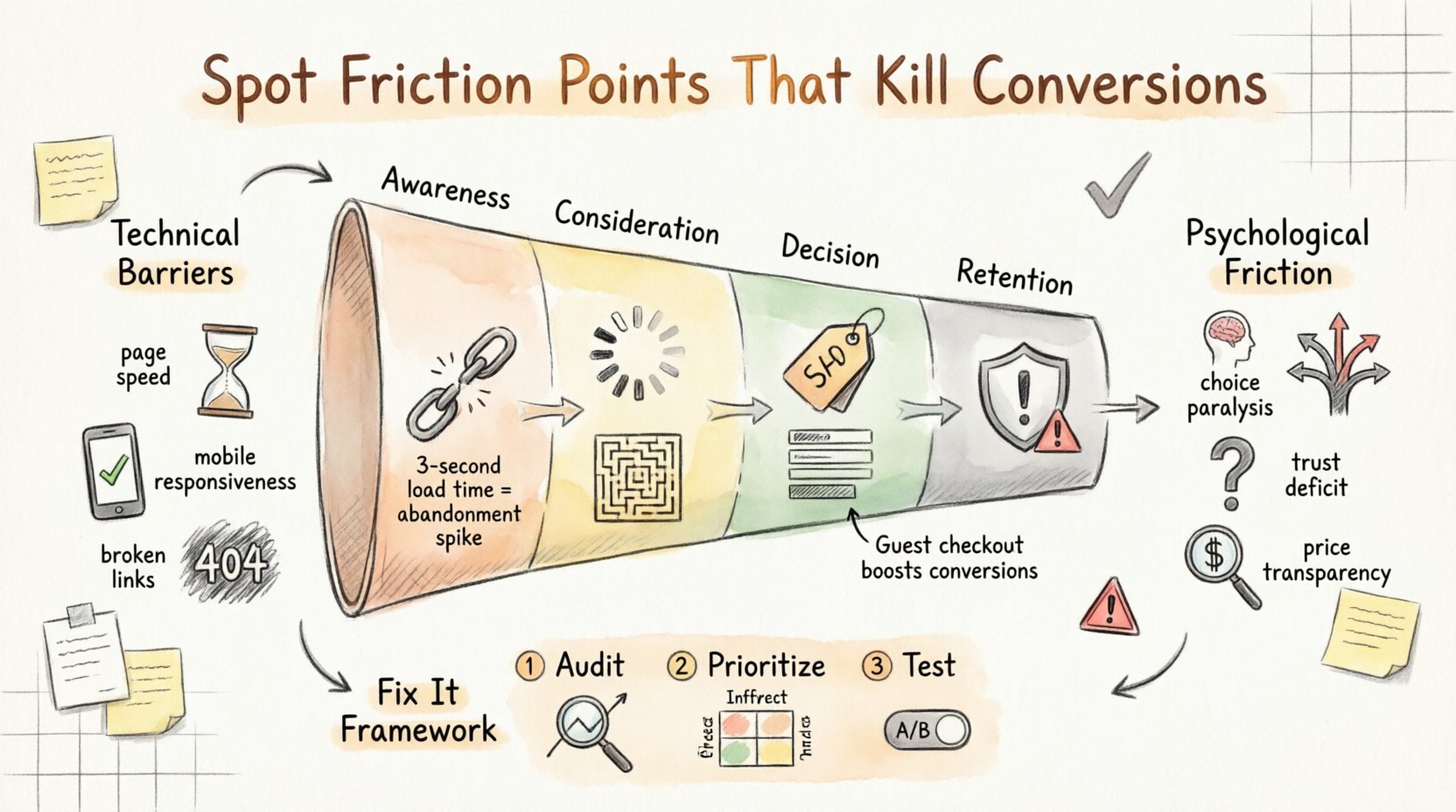
Understanding Friction in the Customer Journey 🗺️
A customer journey map is a visual representation of the steps a person takes to become a customer. It charts the entire lifecycle from first awareness to post-purchase advocacy. Friction points are disruptions in this map. They are moments where the user experience (UX) stops serving the user and starts serving the business in a way that feels intrusive.
Friction is not always negative. Some resistance is necessary for security or qualification. However, unnecessary friction is the primary cause of conversion leakage. It occurs when the cost of doing business with you exceeds the perceived value.
The Four Stages of Friction
To locate these points effectively, we must categorize them by where they occur in the journey:
- Awareness Stage: Friction here prevents discovery. Slow ad loading, irrelevant messaging, or broken landing pages.
- Consideration Stage: Friction here stops evaluation. Unclear value propositions, missing trust signals, or confusing product comparisons.
- Decision Stage: Friction here kills the sale. Complicated checkout forms, unexpected fees, or lack of payment options.
- Retention Stage: Friction here reduces lifetime value. Poor onboarding, confusing account management, or difficult cancellation processes.
Technical Barriers That Slow Down Users ⚙️
Before we look at psychology, we must address the infrastructure. Technical friction is the most objective form of resistance. It is measurable, reproducible, and often the easiest to fix. If the underlying technology fails, the best copy in the world cannot save the conversion.
1. Page Load Speed
Time is the most valuable currency on the web. Users have developed a tolerance for zero milliseconds of delay. When a page takes more than three seconds to load, abandonment rates spike significantly. This is not just about the homepage; it applies to every interaction point.
- Render-blocking resources: Scripts and stylesheets that stop the page from painting pixels immediately.
- Unoptimized assets: Large images and videos that consume bandwidth unnecessarily.
- Server response time: The latency between the request and the server’s initial response.
2. Mobile Responsiveness
Mobile traffic now accounts for the majority of global web usage. A site that functions well on a desktop but fractures on a smartphone creates immediate friction. Touch targets must be large enough for fingers, text must be legible without zooming, and navigation must adapt to smaller screens.
- Horizontal scrolling: Forces users to hunt for content that should be vertically aligned.
- Pop-ups: Aggressive overlays that cover content on small screens.
- Form fields: Input types that trigger the wrong keyboard on mobile devices (e.g., triggering a full keyboard instead of a numeric pad for phone numbers).
3. Broken Links and 404 Errors
A broken link is a dead end. It signals a lack of maintenance and care. When a user clicks a link expecting to find more information and receives an error page, their trust erodes instantly. This is a critical friction point in the consideration phase.
- Redirect chains: Taking multiple hops to reach the destination slows down the process.
- Orphaned pages: Content that exists but has no internal links pointing to it, making it unreachable.
- Outdated resources: Broken images or missing PDF documents linked in content.
Psychological Friction: The Invisible Killers 🧠
Technical friction is visible in logs and analytics. Psychological friction is visible in hesitation. It occurs when the user’s brain perceives a threat, a burden, or confusion. These are the points where logic takes a backseat to emotion.
1. Cognitive Load and Choice Paralysis
When presented with too many options, users often choose none. This is known as the paradox of choice. If a navigation menu is cluttered, or a product page lists too many variants without clear guidance, the user stops thinking and starts escaping.
- Menu clutter: Overly complex navigation structures.
- Feature dumping: Listing every single feature without highlighting the benefits.
- Comparison overload: Allowing users to compare too many products simultaneously without a clear “best for you” recommendation.
2. Trust Deficits
Conversion requires trust. If a user cannot verify that you are legitimate, they will not hand over their credit card information. Trust is built through specific signals that must be placed strategically.
- Lack of contact information: No physical address, phone number, or support email visible.
- Missing security badges: No SSL indicators or payment security icons near the checkout button.
- Unverified claims: Testimonials that look generic or pricing that seems too good to be true.
3. Price Transparency
Hidden costs are the fastest way to kill a conversion. Users hate surprises. If the final price includes shipping, taxes, or fees that were not disclosed until the very last step, the user feels manipulated. This is a form of friction that stems from a lack of honesty.
- Shipping surprises: Adding cost at checkout that was not visible on the product page.
- Tax ambiguity: Not showing estimated taxes until the final calculation.
- Subscription traps: Making it difficult to understand if a purchase is one-time or recurring.
Common Checkout Friction Points 💳
The checkout process is the most critical juncture in the journey. It is where intent becomes revenue. However, it is also where the most data entry occurs. Every field added increases the probability of abandonment.
1. Mandatory Account Creation
Forcing a user to create an account before purchasing is a massive barrier. Many users prefer speed over long-term commitment. They want to buy, not sign up for a newsletter or set up a password.
- Guest checkout: Always offer a guest option.
- Post-purchase account creation: Allow users to save their details after the transaction is complete.
- Social login: Allow sign-in via existing providers to reduce typing.
2. Form Field Anxiety
Forms are necessary, but they can be optimized. Long forms induce fatigue. Users will stop filling them out if they feel the process is too tedious.
- Relevance: Only ask for information essential to the transaction.
- Auto-fill: Design fields to support browser autocomplete.
- Validation: Provide real-time error messages rather than waiting until submission.
3. Payment Method Limitations
Not everyone has a credit card. Restricting payment options limits your addressable market. Users may have a digital wallet they prefer or a local payment method specific to their region.
- Digital wallets: Apple Pay, Google Pay, PayPal.
- Buy Now, Pay Later: Options like Klarna or Afterpay for higher ticket items.
- Regional methods: Local bank transfers or cash-on-delivery where applicable.
Auditing Your Current Experience 🔍
How do you find these points if they are hidden? You need a systematic approach to auditing. You cannot fix what you do not measure. This process involves combining quantitative data with qualitative insights.
1. Analyze Funnel Drop-off Rates
Look at your analytics to see where users exit. If 50% of users leave on the product page, the issue is there. If 80% leave at the shipping calculator, the issue is pricing transparency. Segment this data by device, traffic source, and location to find specific patterns.
2. Conduct User Testing
Numbers tell you what is happening; people tell you why. Watching real users attempt to complete tasks reveals the confusion that analytics miss. You will see them hesitate, click back, or ask questions.
- Usability sessions: Ask users to perform specific tasks and observe their behavior.
- Five-second tests: Show a page for five seconds and ask what they remember.
- Card sorting: Understand how users categorize your information.
3. Review Customer Support Tickets
Your support team hears the complaints first. If users are constantly asking how to cancel, where to find a phone number, or why a discount code isn’t working, those are friction points. Aggregate these questions to identify systemic issues.
4. Heatmaps and Session Recordings
Visual tools can show you where users are clicking and how far they are scrolling. If a key button is below the fold and users never scroll, it is effectively invisible. If users rage-click on an element that is not clickable, they think it is interactive.
- Click maps: Identify where users are trying to click.
- Scroll maps: Identify where attention fades.
- Session replays: Watch specific sessions where drop-offs occurred.
Friction Diagnostic Matrix 📊
To help structure your audit, use the following matrix. It categorizes friction types by their symptoms and impact.
| Friction Type | Common Symptom | Impact on Conversion | Potential Fix |
|---|---|---|---|
| Technical Load | High bounce rate on entry | Immediate abandonment | Optimize images, reduce server latency |
| Form Complexity | Drop-off at checkout | Loss of qualified leads | Reduce fields, enable guest checkout |
| Trust Deficit | Low add-to-cart rate | Failure to initiate sale | Add testimonials, security badges |
| Price Shock | Cart abandonment at final step | Revenue loss | Show total cost early, free shipping threshold |
| Navigation Confusion | Low time on page | Failure to explore | Simplify menu, add internal linking |
| Mobile Incompatibility | High mobile traffic, low mobile conversion | Lost market share | Responsive design, touch-friendly buttons |
Strategy for Removal and Optimization 🛠️
Once you have identified the friction points, you need a strategy to remove them. Prioritization is key. You cannot fix everything at once. Focus on the high-impact, low-effort changes first.
1. Prioritize by Impact and Effort
Use a matrix to rank your findings. Focus on items that have a high impact on conversion and require low effort to implement. These are your quick wins. High effort, low impact items should be deprioritized.
2. Hypothesize and Test
Do not assume a fix will work. Formulate a hypothesis. “If we reduce the form fields by three, conversion will increase by 10%.” Then, test it. A/B testing allows you to compare the current version against a modified version to see which performs better.
- Control: The original version.
- Variant: The version with the friction removed.
- Statistical Significance: Ensure the results are not due to chance.
3. Iterate Continuously
Friction is not a one-time problem. As you add features, new friction points will emerge. User expectations evolve. What works today may not work tomorrow. Regular audits ensure the journey remains smooth.
Long-term Maintenance of Conversion Health 🏥
Optimization is an ongoing practice, not a destination. To maintain high conversion rates, you must build a culture of user-centricity.
- Regular Reviews: Schedule quarterly reviews of analytics and feedback.
- Competitor Analysis: See what others in your space are doing to reduce friction.
- Accessibility Standards: Ensure your site is usable by people with disabilities. This expands your audience and reduces legal risk.
- Clear Communication: Keep users informed about every step of the process. Confirmation emails, order tracking, and status updates reduce anxiety.
Specific Tactics for High-Friction Areas 🎯
Here are specific tactics you can apply to common problem areas immediately.
1. Reducing Form Abandonment
- Inline Validation: Tell users immediately if an email is invalid, don’t wait for submission.
- Progress Indicators: Show users how far they are in a multi-step form.
- Autocomplete: Use browser capabilities to fill in address or name fields.
2. Improving Product Clarity
- High-Quality Imagery: Allow zooming and multiple angles.
- Video Content: Show the product in use.
- FAQ Sections: Address objections directly on the product page.
3. Building Trust Signals
- Real Reviews: Use third-party verified review systems.
- Money-Back Guarantees: Reduce the risk for the buyer.
- Social Proof: Show user counts or “recently purchased” notifications.
Measuring Success Beyond Revenue 📈
While revenue is the ultimate metric, it is a lagging indicator. You need leading indicators to know if you are fixing friction before the money changes hands.
- Completion Rates: How many users finish the checkout vs. how many start?
- Time on Page: Does it decrease for checkout pages (good) or increase for landing pages (bad)?
- Support Ticket Volume: Are fewer people asking about basic issues?
- Cart Value: Does removing friction allow users to spend more?
The Human Element of Optimization 👤
Finally, remember that you are optimizing for humans, not algorithms. Technology changes, but human psychology remains relatively constant. People want speed, clarity, and fairness. When you align your digital presence with these needs, you remove the friction that stands in the way.
This process requires patience and attention to detail. It involves listening to data and listening to people. By systematically identifying and removing these barriers, you create a seamless experience. You make it easy for people to say yes. In the absence of friction, conversion is simply the natural outcome of a good user experience.
Start your audit today. Look at your journey map. Find the bumps. Smooth them out. The revenue will follow.