


Understanding how people move through your digital presence is the backbone of sustainable growth. It is not enough to simply attract visitors; you must understand the path they take from discovery to decision. This process, known as customer journey analysis, reveals the hidden mechanics of user behavior. By examining each touchpoint, you identify where interest fades and where friction blocks progress. This guide explores actionable strategies to enhance conversion rates by mapping and refining the user experience.
Why Journey Analysis Matters for Conversion 🧠
Conversion optimization often focuses on isolated elements: a button color, a headline, or a form field. While these micro-changes matter, they operate within a larger ecosystem. A visitor does not experience a single page in a vacuum. They arrive from an email, land on a landing page, browse a product list, and perhaps abandon their cart before returning via social media. This complexity creates a non-linear path.
When you conduct a thorough journey mapping exercise, you shift from a page-by-page mindset to a holistic view. This shift allows you to spot inconsistencies that drive users away. For instance, a promise made in an ad might not be fulfilled on the landing page. This disconnect creates cognitive friction. Users feel uncertainty and leave.
- Identify Drop-off Points: See exactly where users stop engaging.
- Understand Motivations: Learn why users move from one stage to another.
- Align Messaging: Ensure your tone matches the user’s intent at every step.
- Reduce Friction: Remove obstacles that slow down the decision-making process.
Without this analysis, optimization efforts are often guesses. You might improve a checkout page, only to realize the problem started three clicks earlier on the product page. Journey analysis connects these dots, providing a clear roadmap for improvement.
The Foundation: Mapping the Current State 🗺️
Before implementing changes, you must document the current reality. This involves gathering data from multiple sources to build a complete picture. Relying on a single metric is insufficient. A high traffic count means nothing if no one converts. A high bounce rate might indicate a bad landing page, or it might mean the user found what they needed immediately.
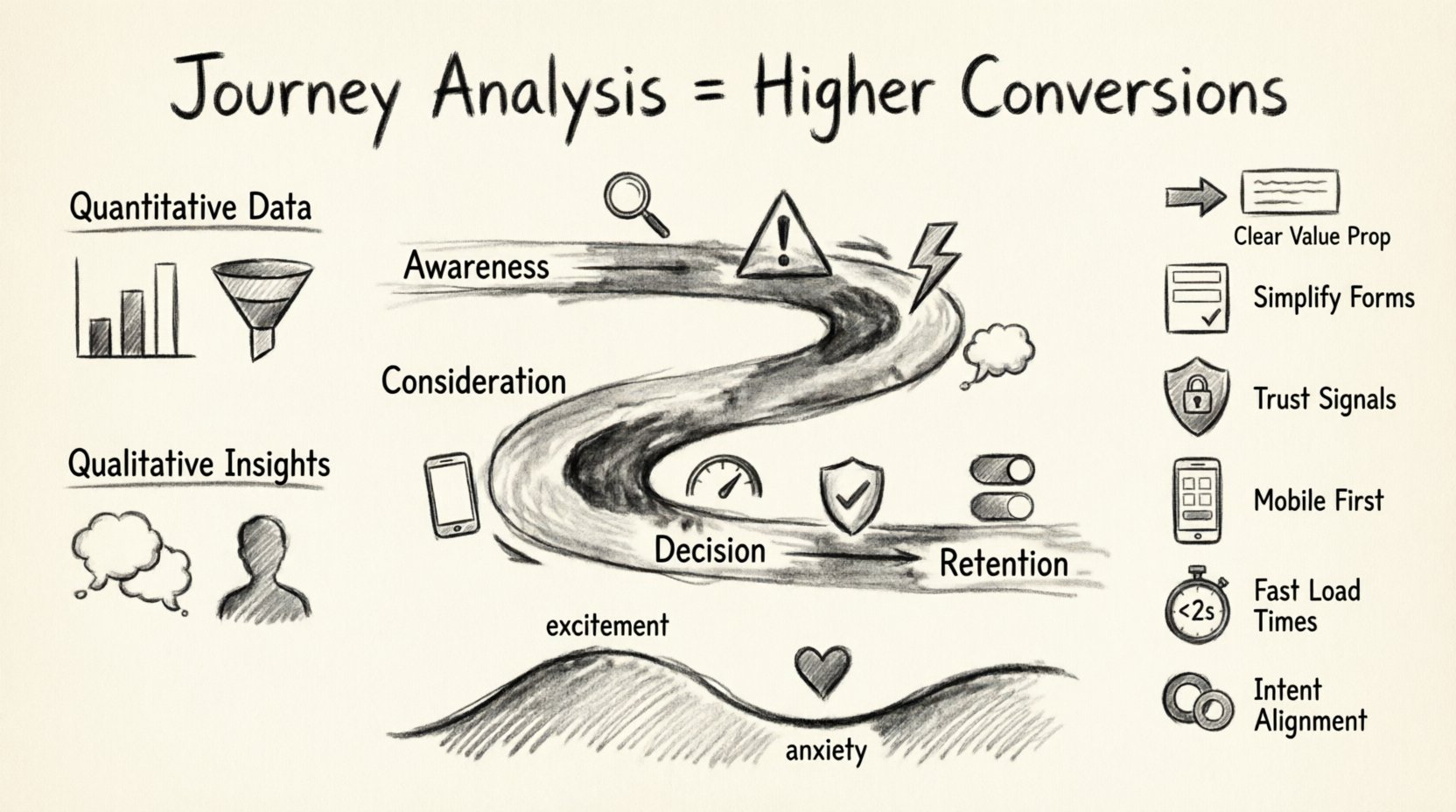
1. Quantitative Data Analysis
Numbers tell you what is happening. You need to look at traffic patterns, session durations, and exit rates. Focus on the following metrics:
- Funnel Drop-off Rates: Calculate the percentage of users who leave at each step of the process.
- Time on Page: Determine if users are reading content or bouncing immediately.
- Click Paths: Observe which links are most frequently clicked to understand navigation habits.
- Device Usage: Check if mobile users behave differently than desktop users.
2. Qualitative Insights
Numbers do not explain why. Qualitative research fills this gap. You need to hear directly from your audience or observe their behavior closely.
- User Interviews: Ask past customers about their decision process.
- Session Recordings: Watch how users interact with elements on the screen.
- Feedback Forms: Use post-interaction surveys to capture immediate sentiment.
- Support Tickets: Review common questions or complaints to find recurring pain points.
3. Building the Journey Map
Once data is collected, visualize the flow. Create a diagram that outlines the stages a typical user goes through. Common stages include Awareness, Consideration, Decision, and Retention. For each stage, list the specific actions, emotions, and touchpoints involved.
This map serves as your baseline. It highlights the ideal path versus the actual path. The gap between these two paths represents your opportunity for improvement.
Identifying Friction Points 🛑
Friction is anything that makes it harder for a user to achieve their goal. In the context of conversion, friction is the enemy. It slows down the journey and increases the likelihood of abandonment. Friction is not always technical; it is often psychological.
Common types of friction include:
- Cognitive Load: The user has to think too hard to proceed.
- Technical Barriers: Slow load times, broken links, or mobile incompatibility.
- Trust Issues: Lack of social proof or unclear privacy policies.
- Process Complexity: Too many fields in a form or too many steps to checkout.
To find these friction points, you can use the table below to categorize issues found during your analysis.
| Friction Type | Signs of Occurrence | Impact on Conversion |
|---|---|---|
| Cognitive | High bounce rate on complex pages | Users leave due to confusion |
| Technical | High exit rate on slow-loading pages | Users leave due to frustration |
| Trust | Low completion on checkout pages | Users hesitate due to risk |
| Process | Cart abandonment spikes | Users leave due to effort |
Quick Wins for Conversion 🏆
Once you have identified the friction points, you can implement targeted improvements. These are not massive overhauls but strategic tweaks that yield immediate results. The goal is to make the journey smoother, faster, and more intuitive.
1. Clarify Value Propositions Early
Users decide within seconds whether to stay or leave. If your main headline does not clearly state what you offer, they will not wait. Ensure the first screen of your website communicates the core benefit immediately.
- Use clear, benefit-driven headlines.
- Place the primary call to action (CTA) above the fold.
- Remove distracting elements that compete with the main message.
2. Simplify Form Fields
Every additional field in a form increases the chance of abandonment. Only ask for information that is absolutely necessary. If you do not need a phone number, do not ask for it.
- Reduce the number of input fields to the minimum.
- Use inline validation to correct errors in real-time.
- Group related fields together logically.
- Provide clear labels and placeholder text.
3. Strengthen Trust Signals
Trust is the currency of conversion. If a user does not trust the site, they will not share their data or money. Display evidence of reliability prominently.
- Showcase customer reviews and testimonials near purchase buttons.
- Display security badges or certification logos clearly.
- Include an “About Us” section that humanizes the brand.
- Provide transparent contact information and return policies.
4. Optimize for Mobile First 📱
A significant portion of traffic comes from mobile devices. If the experience is clunky on a phone, you lose a large segment of potential customers. Mobile optimization is not just about resizing images; it is about touch interactions.
- Ensure buttons are large enough to tap easily.
- Check that forms are easy to fill on small screens.
- Minimize pop-ups that block content on mobile.
- Test load speeds specifically on cellular networks.
5. Reduce Page Load Times ⚡
Speed is a conversion factor. Users expect pages to load instantly. Delays cause frustration and lead to abandonment. Even a one-second delay can impact performance significantly.
- Compress images without losing quality.
- Minimize the use of heavy scripts and plugins.
- Utilize caching mechanisms to serve content faster.
- Choose a reliable hosting provider.
6. Align Content with User Intent
Users arrive with specific goals. If you send them to a page that does not match their intent, they will leave. Analyze the keywords they used to find you and ensure the landing page reflects that search intent.
- Create dedicated landing pages for specific campaigns.
- Match the language in your ads to the language on your site.
- Ensure navigation paths lead directly to relevant products.
Handling Cross-Channel Consistency 🔄
Modern journeys are rarely contained within a single website. Users move between email, social media, search engines, and direct visits. Inconsistency across these channels confuses users and breaks trust.
If an email advertises a 20% discount, but the landing page shows full price, the user feels misled. This disconnect creates friction that is hard to overcome. You must ensure that branding, messaging, and offers remain consistent regardless of where the user is.
Check the following areas for consistency:
- Visual Identity: Colors, fonts, and imagery should match across channels.
- Tone of Voice: The writing style should feel familiar whether in an ad or on a site.
- Offer Accuracy: Promotions and pricing must be synchronized.
- Call to Actions: The next step should be clear and identical across touchpoints.
Testing and Iteration 🔄
Journey analysis is not a one-time task. User behavior changes over time, as does the market. Continuous improvement requires a cycle of testing and learning.
1. A/B Testing
When you make a change, test it against the original. Show version A to half your users and version B to the other half. Measure which version performs better. This method removes guesswork and relies on actual performance data.
- Test one variable at a time for clarity.
- Run tests for a sufficient duration to gather statistical significance.
- Document results to build a knowledge base for future decisions.
2. Segment Your Audience
Different groups of users behave differently. A new visitor might need more information than a returning customer. Segment your analysis to find specific opportunities.
- Analyze behavior by traffic source (organic vs paid).
- Separate data for new users versus returning users.
- Look at behavior by device type (mobile vs desktop).
3. Monitor Key Performance Indicators (KPIs)
Define what success looks like for each stage of the journey. Track these metrics regularly to spot trends.
- Awareness: Traffic volume and reach.
- Consideration: Time on site and pages viewed.
- Decision: Conversion rate and cost per acquisition.
- Retention: Repeat purchase rate and customer lifetime value.
The Emotional Dimension of the Journey ❤️
Logic plays a role in buying decisions, but emotion often drives them. A user might logically understand a product but feel anxious about purchasing it. Journey analysis should also account for emotional states.
Map the emotional highs and lows. Where does the user feel excited? Where do they feel doubt? Addressing these emotions can significantly boost conversion.
- Reduce Anxiety: Offer guarantees, free trials, or money-back promises.
- Build Excitement: Use engaging visuals and compelling storytelling.
- Provide Reassurance: Show customer support availability and response times.
Understanding the emotional journey helps you write copy that resonates. Instead of just listing features, explain how the product makes the user feel. This connection builds loyalty and increases the likelihood of a sale.
Long-Term Maintenance of Journey Analysis 📈
Implementing these strategies is the start, not the finish. To maintain high conversion rates, you must keep the journey fresh and relevant. Markets shift, technology evolves, and user expectations rise.
Establish a regular review cadence. Schedule quarterly audits of your journey maps. Compare current data against historical benchmarks. Look for new drop-off points that may have emerged. Stay responsive to feedback from customer support teams.
By treating journey analysis as an ongoing practice, you ensure that your conversion strategy remains effective. You build a system that adapts to change rather than breaking under it. This proactive approach leads to steady, sustainable growth over time.
Summary of Actionable Steps ✅
To wrap up, here is a checklist for implementing journey analysis to improve conversion:
- Map the Current Path: Document every step a user takes.
- Collect Data: Use both quantitative and qualitative methods.
- Find Friction: Identify where users struggle or leave.
- Implement Quick Wins: Simplify forms, clarify messaging, and optimize speed.
- Ensure Consistency: Match experiences across all channels.
- Test Changes: Use A/B testing to validate improvements.
- Monitor Emotions: Address user feelings and trust levels.
- Review Regularly: Update your maps as behavior changes.
Conversion is not a magic trick. It is the result of a well-designed experience. By focusing on the journey, you create a path that guides users naturally toward their goal. This approach respects the user and delivers value at every step. With patience and attention to detail, you can turn a complex journey into a streamlined conversion engine.
Final Thoughts on Continuous Improvement 🌱
The digital landscape is dynamic. What works today might not work tomorrow. The key to long-term success is agility. Stay curious about your users. Keep listening to their feedback. Keep analyzing their behavior. This cycle of observation and action is the core of effective conversion optimization.
When you prioritize the user experience over short-term gains, you build a foundation that supports growth. Users appreciate clarity, speed, and trust. By delivering these elements through a well-analyzed journey, you create an environment where conversions happen naturally. Focus on the journey, and the results will follow.